Open Source Redesigned
What’s trending in design, why it isn’t easy to find designers, how open-source is different than other products, and how to look bigger than you are.
I had the pleasure of talking to Alex Barashkov, CEO @ PixelPoint, a Design studio focusing mainly on open-source products.
You can listen to it here 👇
Difficulty with designers
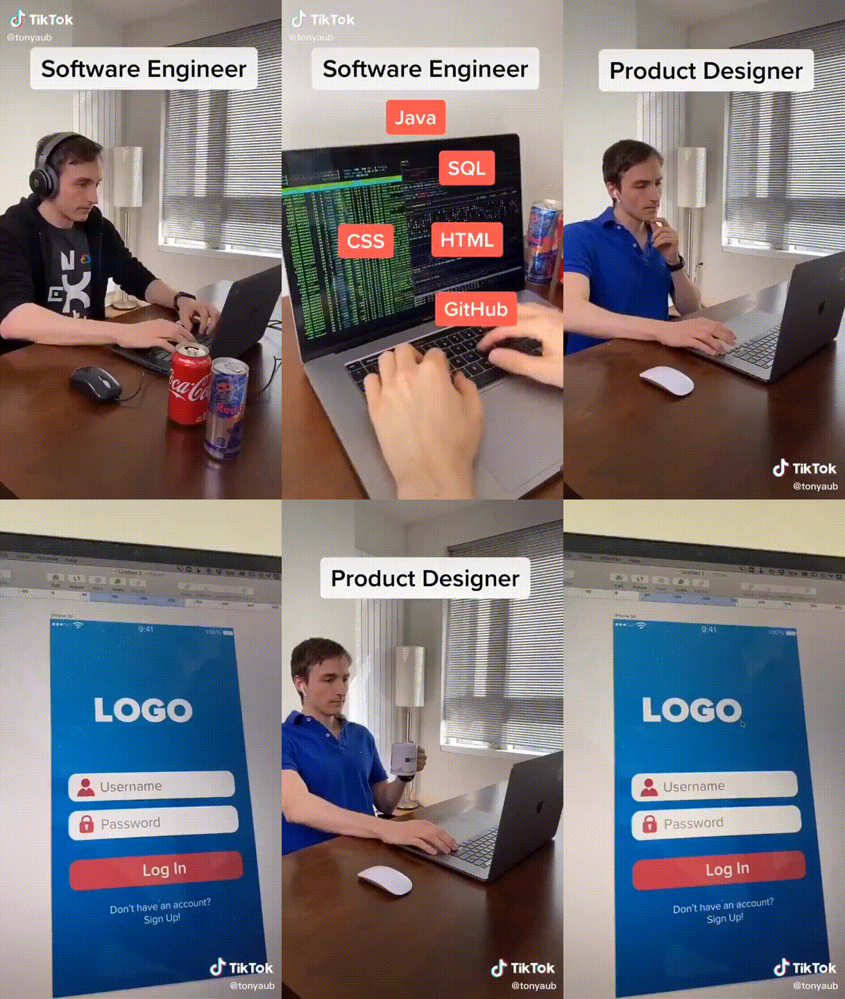
When talking about sales, marketing, and even insurance designs, it’s a well-known term for almost every designer because they have seen it somewhere in their life. But when talking to designers about “Docker,” “Kubernetes,” “Lambda Observability,” and so on, that’s something that starts to sound like Gibbreish even to senior designers. At the end of the day, you can teach them what it is, but they won’t understand it intensely because they are unaware of the technical world and won’t be able to provide you with additional insights and understanding of the end-user. That’s where PixelPoint shines. Words like CI/CD and Websockets are familiar to them.
Open-source is different than the others.
When talking about open-source design, it usually revolves around the community, issues, pull requests, and feature requests. Iterations are generally faster because it’s living on the community feedback. We can often see community members contributing to the marketing website or the app without discussing it with the designers beforehand. After that, it will be redesigned by the designers.
What’s familiar with most open-source products
Many developers usually value code and architecture as “pure” open-source, and every piece of material outside of it, such as design, marketing, and sales, will stain it. That’s why most of the open-source products we see out there look like simple HTML pages with links and documentation. And while that might be ok, many of the other times, they miss one of the essential parts – UX. Think about what it means to go to an open-source website and look for more than 20 seconds to find the GitHub link or the Documentation.
Starting from design ⛔️
We can also see some open-source founders starting from design instead of code/open-source. Instead of actually working in an open-source way, they go and start with the marketing website, creating landing pages when they actually focus on the community and their GitHub project. When talking to developers, first thing first, you should always talk about the technical aspect behind it.
Look bigger than you are
Having an excellent design makes you look bigger. We had a big customer turning us a few weeks back and said the website looks so neat, and how big are we? And we actually said we started six months ago. Perception creates reality.
Finding good designers
Unfortunately, in today’s world, finding a senior designer is not an easy task as most senior designers would probably look to work at more prominent companies (After raising a B round). So your best option is to take a senior designer as an advisor in the company or hire an agency.
What to put on the marketing website
One of the biggest trends we can see out there today is “dark mode,” 3d, and gradients and animations. Those are all fantastic things you can add to your website. They are not mandatory. They can help by providing more context of what’s going on on your website and attracting visitors to spend more time at your website. However, based on developers’ feedback, what is really crucial is having good documentation and code snippets on the main page.
I like to play a game I call “find the API,” where I see how quickly I can make my way from the home page to the documentation. I don’t always win – DuVander, Adam. Developer Marketing Does Not Exist
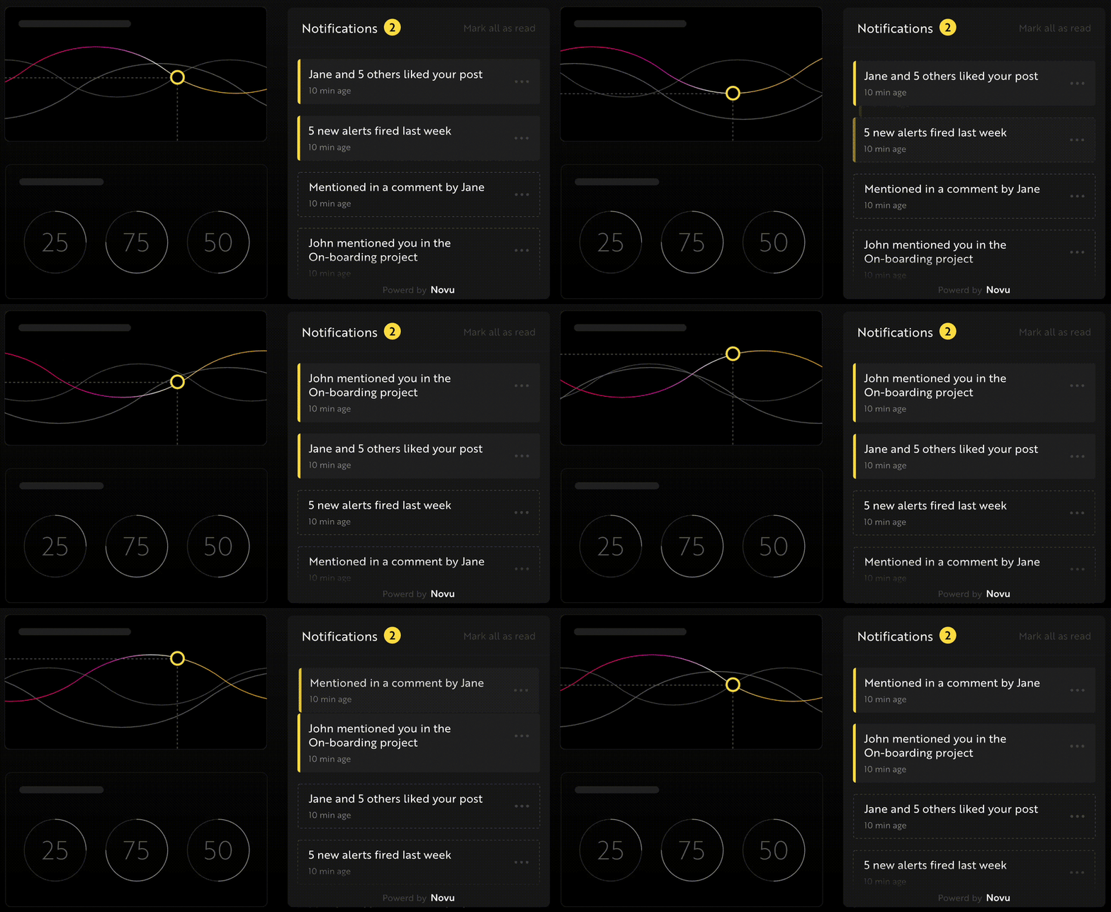
Novu animation about notifications that give more context
P.S I would really appreciate it if you could help us with a star on GitHub
https://github.com/novuhq/novu


